


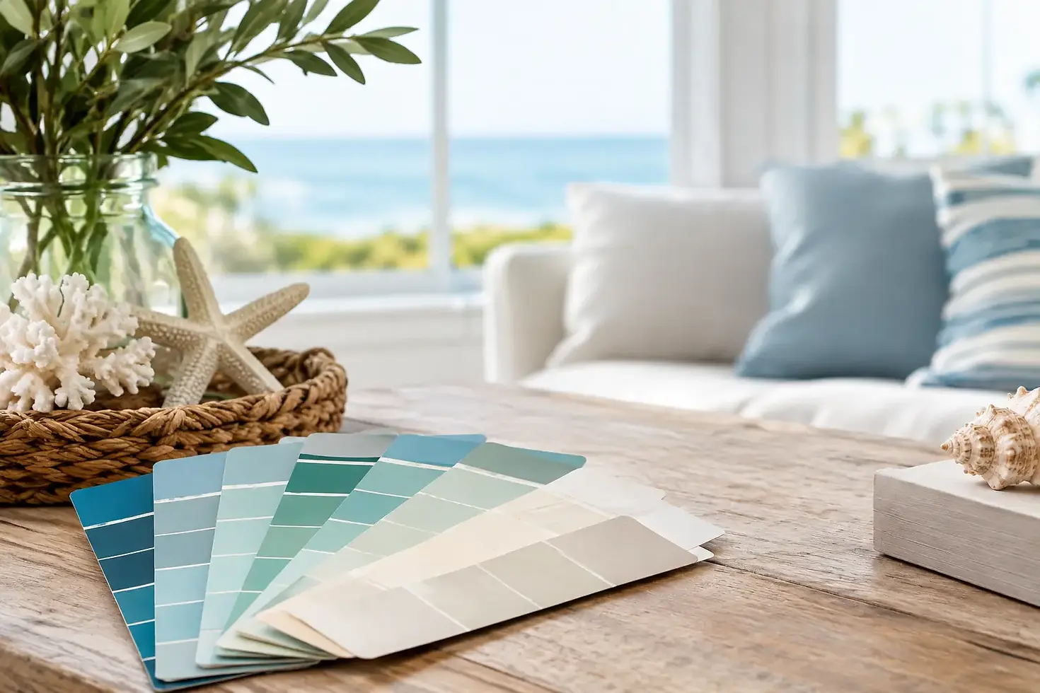
Best Coastal Art Colour Palettes for Your Home

A room can have beautiful furniture and still feel like it could be anywhere. The right artwork changes that. The best coastal art colour palettes do more than add blue to a wall - they bring back a particular stretch of sand, the first light over the lineup, or that late-afternoon drive home with boards on the roof.
For a home that feels genuinely connected to the coast, think beyond the predictable turquoise-and-white formula. Australia’s shoreline has endless moods: sun-bleached dunes, deep Pacific swells, soft sea mist, red sandstone headlands and those punchy summer skies that make a surf break feel electric. Your palette should reflect the place, the light in your room and the feeling you want to come home to.
How to choose a coastal palette that feels like home
Start with the light. A bright north-facing living room can carry richer ocean blues, dark ink lines and warm sunset colours without feeling heavy. In a smaller room or apartment with limited natural light, pale sand, washed aqua and chalky whites will keep the space open.
Then look at the colours already doing the work in your home. Timber floors, rattan, linen, concrete and white walls all sit naturally beside coastal art, but each calls for a slightly different print. Warm oak and tan leather suit sun-faded palettes. Cooler grey tiles and crisp white joinery can take cleaner blues, soft greens and graphic black details.
Most importantly, choose a palette linked to a memory or a place. A print inspired by the Gold Coast will feel different from a moody Victorian coastline or a warm Bali point break. That personal connection is what keeps coastal art from feeling like generic holiday décor.
The best coastal art colour palettes to consider
Salt, sand and soft white
This is the quiet, sun-washed palette: warm ivory, oyster, pale beige, driftwood brown and a touch of faded blue-grey. It works beautifully in bedrooms, relaxed living spaces and beach houses where you want the wall art to feel calm rather than commanding.
Choose artwork with open sky, long beaches, simple linework or a distant wave. The contrast should be gentle, with enough darker detail to give the piece shape. Pair it with natural linen, light timbers and woven textures for a look that feels easy, not overly styled.
Reef blue and sea glass green
For homes that need a little lift, reef blue, aqua, sea glass green and clean white bring the fresh side of coastal living indoors. This palette suits bright kitchens, holiday rentals and casual family rooms, especially where there is plenty of natural light.
The trade-off is that vivid aqua can quickly feel too tropical if every surface carries it. Let the artwork be the hit of colour, then keep surrounding cushions, ceramics and larger furniture more neutral. A single print with a clear waterline or a familiar summer surf break is often all the room needs.
Deep Pacific blue and ink
Not every coastal home needs to be pale. Deep navy, indigo, midnight blue and near-black ink capture the power of an offshore morning or a solid swell wrapping around a headland. This is one of the best coastal art colour palettes for a study, dining room, hallway or a living space with white walls that need definition.
These darker tones look particularly good in framed prints, where a crisp border gives the image room to breathe. Add a touch of warm timber, tan leather or brass nearby so the room stays inviting. The result is coastal, but with more depth and edge than a typical beachy scheme.
Summer sunset and faded coral
Think faded coral, peach, dusty pink, warm yellow and soft lavender sitting against a sunlit blue sky. This palette has the feeling of a late surf check, a salty ute parked near the dunes, or a summer road trip with nowhere urgent to be.
Sunset tones work well in spaces that already have warmth: terracotta tiles, timber furniture, sandy rugs or creamy painted walls. They are also a great choice for gift art because they carry a sense of nostalgia without needing to match a particular decorating style. Keep the shades weathered rather than sugary, and the look stays grown-up.
Dune, eucalypt and headland green
Coastal colour is not only water and sky. The scrub behind the beach, the eucalypts above the track and the grassy headland before a paddle out all bring a grounded green to the landscape. Combine muted sage, olive, dune beige, clay and off-white for a palette that feels distinctly Australian.
This is an especially good direction if bright blue does not suit your home. A coastal print with a green headland or earthy foreground can connect with indoor plants, timber and textured neutral furnishings while still holding onto the ocean lifestyle. It feels considered, relaxed and less expected.
Storm grey and whitewater
Storm grey, slate, charcoal and whitewater create a more dramatic coastal story. These are colours for winter swells, early alarms and the kind of day surfers remember because the conditions were worth it. They suit contemporary interiors, darker feature walls and spaces with concrete, black accents or streamlined furniture.
To stop this palette from feeling cold, bring in one warming note - a timber frame, a sandy rug or a muted rust cushion. Artwork with breaking waves, cloud cover or a recognisable rugged coastline can turn a blank wall into a strong focal point without shouting.
Match the artwork to the mood, not just the sofa
It is tempting to choose art solely to match a cushion or paint sample. That can work, but coastal art is often strongest when it creates a little contrast. A mostly neutral room may need a bold blue horizon. A room filled with cool tones may come alive with a warm, sun-faded print from a favourite summer destination.
Scale matters too. A small print can hold a personal memory beside a bedside table or in a narrow entry. A larger framed piece has enough presence for above a sofa, dining setting or bed, where it can set the colour direction for the whole room. If you are building a gallery wall, repeat one or two tones across the collection rather than trying to make every image identical.
Location-based artwork makes this easier. A print inspired by the Sunshine Coast, Northern New South Wales, Sydney or Rottnest carries its own colour cues, shaped by that coastline’s water, landscape and light. At Surf Prints Australia, that sense of place is the point: art should remind you of somewhere real, not simply fill an empty patch of wall.
Let your coastal colours evolve with the season
You do not need to redecorate when the weather changes. Swap a throw, move a favourite print to another room, or let a smaller framed piece sit on a shelf for a more casual look. In summer, brighter blues and coral tones can take centre stage. Through cooler months, bring forward deeper navy, storm grey and dune colours.
The best choice is the palette that gives you an instant sense of salt air, open space and the next good swell. Put that feeling where you will see it every day, and the room will always have a way back to the coast.


Comments